.svg)


When we first envisioned On Way Storytellers, the feeling was clear: we wanted a space that felt warm, intelligent, artful, and deep. But how do you translate a feeling into a visual identity? How do you create a look that feels like a quiet library corner, a sun-drenched Turkish bazaar, and a misty Irish morning all at once, without being chaotic?
This was the challenge we faced. The journey to our visual style was as much an exploration as any of our Content Seasons. It wasn't about picking pretty colors; it was about asking deep questions and making intentional choices to build a visual language that could carry the weight of the stories we wanted to tell.
The starting point: our "uncategory" vision
We knew what we didn't want. We didn't want the bright, oversaturated look of typical travel influencer feeds. We didn't want the cold, academic feel of a historical journal. And we didn't want the generic template look of a standard blog.
Our core challenge was to create something that felt both sophisticated and authentic, researched and relatable. We were deeply inspired by the timeless quality and intentional rhythm of print magazines. This wasn't just an aesthetic choice; for Ola, it was a return to a passion she had set aside. Years ago, as the Vice Editor-in-Chief of Poland's largest student magazine, she lived the monthly cycle of bringing stories to life – from working with journalists to designing layouts in InDesign. That dream of writing and curating, further honed by her time at the Polish School of Reportage, provides the structural and narrative spine of our work.
But a story's spine needs a soul, and that comes from Riza's artful eye. Since his teenage years playing with classic film cameras, he has been fascinated not just by what a photo captures, but how it feels. His love for cinema isn't just about plot; it's about observing how light shapes a scene, how a specific camera angle creates emotion, and how music - a passion he explored for years as a bassist in a rock band - builds an entire atmosphere. This deep sensory curiosity, from photography to film to sound, is the source of our commitment to visuals with soul. Together, we're blending the thoughtful architecture of a print publication with the evocative, sensory depth of cinema to create a space that feels both classic and immediate.
The creative question: how do we show layered meaning?
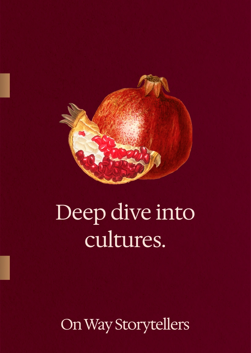
Our Pomegranate Philosophy guides everything we do, so our most important visual question was: How do we visually represent "layers"?
A single photograph, no matter how beautiful, often captures just one moment, one surface. This led us to our signature element: the photo-collage. By intentionally layering Riza's evocative photography with historical maps, botanical illustrations, architectural details, textures, and fragments of art, we could create a single image that holds multiple stories. The collage became our visual equivalent of "connecting the dots" - a way to show history, nature, and human experience all intertwined in one frame.
The turning point: why we chose to collaborate
As we developed these ideas, we reached a crucial milestone. We had a strong vision (the what and why), but we needed a professional system to execute it sustainably (the how). As two people juggling demanding 9-to-5s, we knew that designing every single social media post, story template, and website element from scratch would lead to burnout and inconsistency.
We asked ourselves: How can we protect our creative energy for what we do best – research, storytelling, and visual creation – while still ensuring a cohesive, high-quality brand experience?
The answer was clear: we needed to invest in a system. This is when we made the conscious decision to hire a creative agency. It wasn't about outsourcing our vision; it was about finding a partner who could help us build the beautiful, functional house for our vision to live in. We came to them not with vague ideas, but with a deep understanding of our brand, our audience, our "Uncategory" positioning, and even our specific "9 Grid Archetype" needs for Instagram.
The result: a visual system built for depth & rhythm
Working with an agency allowed us to translate our philosophy into a tangible, repeatable system. They helped us solidify our color palette (the warm burgundy, the creamy neutrals), choose typography that felt both elegant and readable, and design the templates you see today.
This collaboration was an act of "Artful Integration" in itself - blending our raw creative vision with the agency's structural expertise. It gave us the freedom to focus on telling rich stories, knowing that the visual container for those stories was both beautiful and consistent.
Our visual identity isn't just decoration. It's a direct reflection of our core beliefs: that stories are layered, that context is beautiful, and that building something meaningful requires both artful passion and thoughtful structure. It's the visual expression of our "On Way" journey.